
Reconstruct Social.plus Design System with Design Tokens.
Company
Social.plus (formerly Amity)
My Contribution
Design Tokens Creation
Design Tokens Organizing
Component Creation
Team
Social.plus
Social.plus provides a comprehensive suite of pre-built modules, SDKs, APIs, and a UI Kit, enabling effortless creation of social ecosystems with seamless scalability and integration across all platforms. Hundreds of brands, including industry leaders like True ID, Ulta Beauty, and Noom, have leveraged Social+ to build thriving in-app communities.
The core challenge in developing the Social.plus UI Kit revolved around architecting a design system that not only ensured massive scalability but also offered unparalleled customization, catering to a wide range of client requirements.
Previous Design System: The Challenges
Upon joining Social.plus, I identified several critical limitations within our existing design system that hindered scalability, consistency, and overall usability.
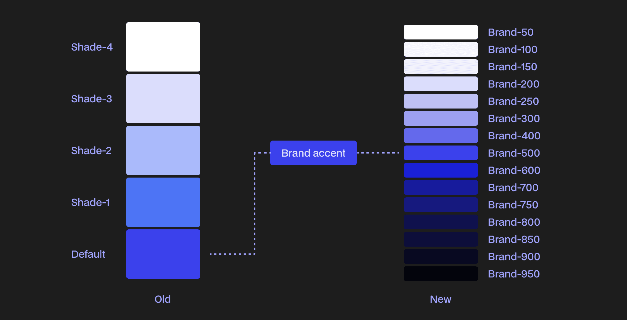
Limited Color Palette: Our color palette was restricted to just five scales per color. This severe limitation made it challenging to achieve nuanced visual hierarchy, create diverse states, or effectively adapt to the varied branding needs of our clients.
Inconsistent Variable Management: The non-contextual naming conventions for design tokens and variables led to significant ambiguity. The same variables were frequently applied across different components and contexts, resulting in unpredictable visual outcomes and a fragile system.
Poor Accessibility: Crucially, the system exhibited poor accessibility compliance. This directly translated into significant readability and usability issues for end-users, failing to meet essential modern web standards.
Maintenance & Scalability Hurdles: The rigid structure meant that components often shared hard-coded color values. A seemingly minor change to a single color variable would unintentionally propagate across numerous disparate components, leading to extensive refactoring, breaking design consistency, and ultimately crippling future scalability and customization efforts for our clients.
Introducing Design Token
The source of truth between designers, engineers, and stakeholders.
To tackle the critical scalability, customization, and consistency challenges of our Social.plus UI Kit, we implemented Design Tokens. These tokens, a new standard under the W3C umbrella, serve as the single source of truth for all design variables – from color and typography to spacing and beyond. This approach not only unifies design and code, but also ensures consistent and unified product experiences while enabling the flexibility and control our clients need.

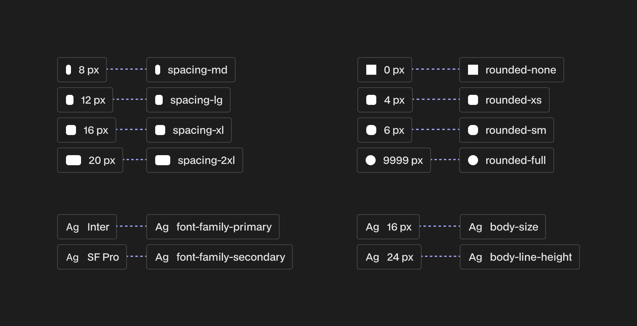
The Pyramid of Design Token Structure
To ensure a robust, scalable, and customizable system, we adopted a three-layered Pyramid Design Token Structure, abstracting design values into increasingly specific applications:
Primitive Tokens: The foundational layer, directly mapping to raw, immutable values like hex codes (#FFFFFF) or pixel units (16px). These are never used directly in components, only aliased by higher layers
Semantic Tokens: Define the contextual purpose of values within the system (e.g., bg-primary). They alias Primitive Tokens to create our visual vocabulary, ensuring consistent styling across themes and modes.
Component Tokens: This final layer offers crucial customization for our UI Kit. Specific to individual components (e.g., btn-bg-primary), these tokens can alias either Primitive or Semantic Tokens, enabling clients to seamlessly tailor components to their unique branding and existing design systems.

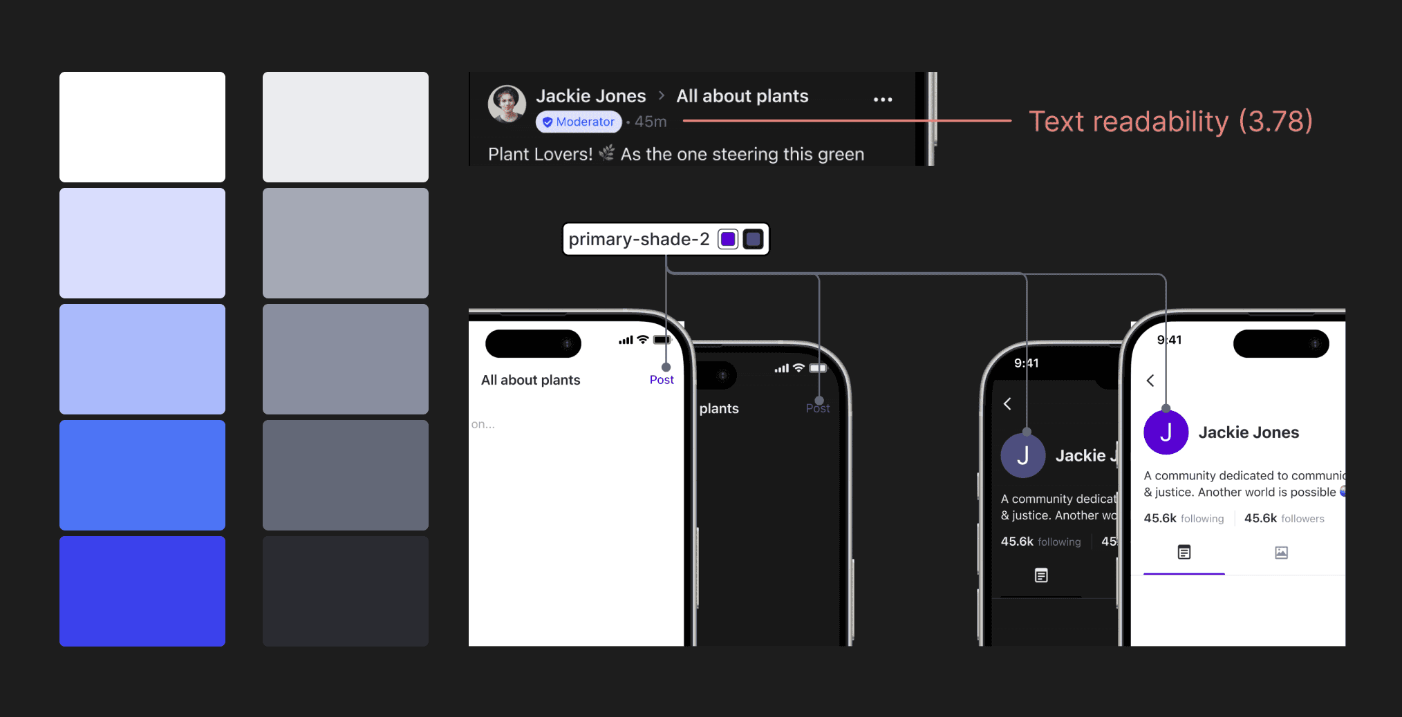
Color Shading & Contrast Accessibility
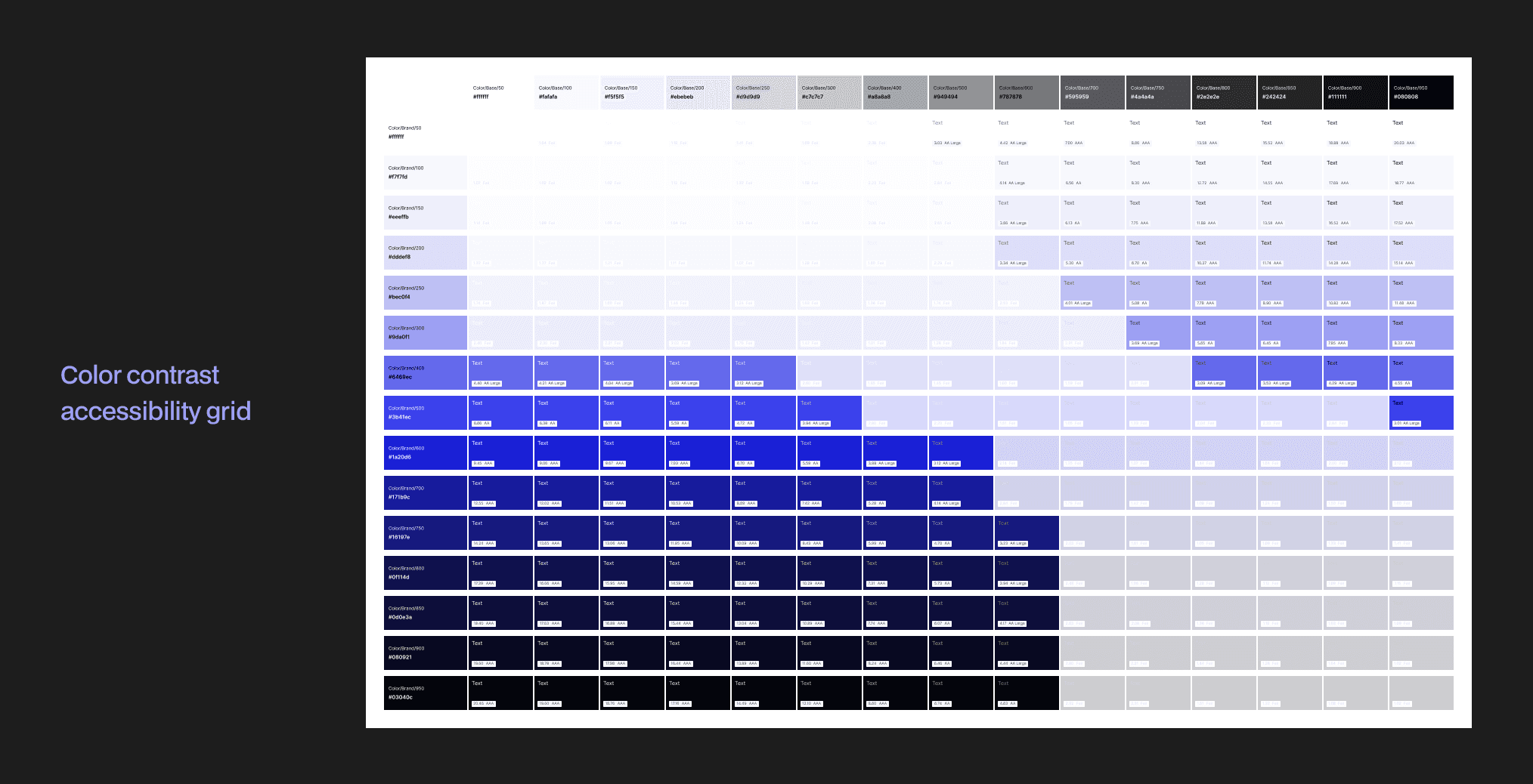
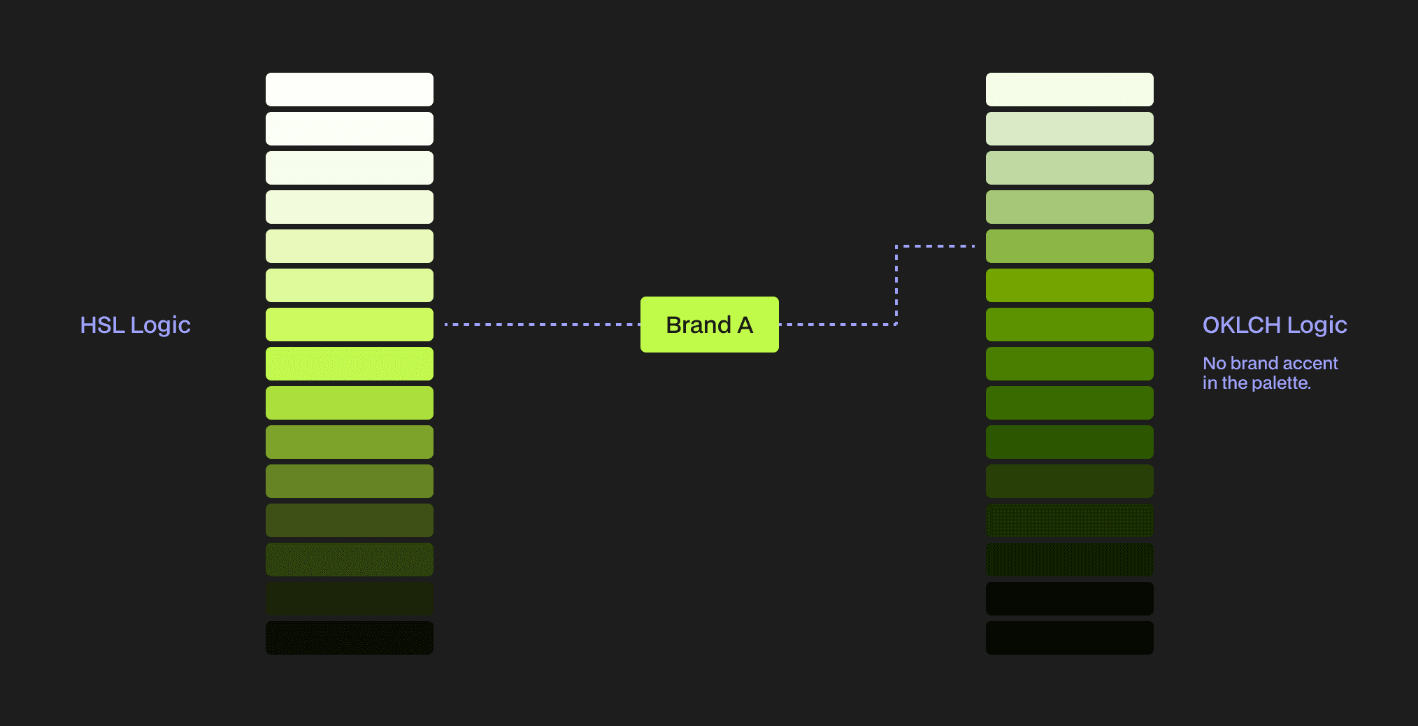
To overcome the severe limitations of our previous 5-shade palette, we developed an expanded 15-shade color system. By methodically generating shades using the HSL (Hue, Saturation, Lightness) model, we achieved precise, perceptually uniform variations, offering vast design flexibility. Crucially, we embedded color contrast accessibility rules into this system, ensuring all combinations meet or exceed WCAG 2.2 AA standards for optimal readability and inclusivity.
Dynamic brand accent
To provide unparalleled brand integration, we implemented a dynamic brand accent color palette. This system intelligently positions a client's core brand color within our 15-shade scale, dynamically assigning it to the most appropriate shade based on its HSL lightness value. This ensures their brand color is represented accurately and flexibly across the UI, rather than being confined to a single, fixed point.
I also explored OKLCH shading logic for enhanced consistency. However, OKLCH's inherent color shifting proved too restrictive for client customization and brand fidelity. Our deliberate decision to stay with HSL ultimately prioritized the flexibility and accurate representation for Social.plus diverse clients.

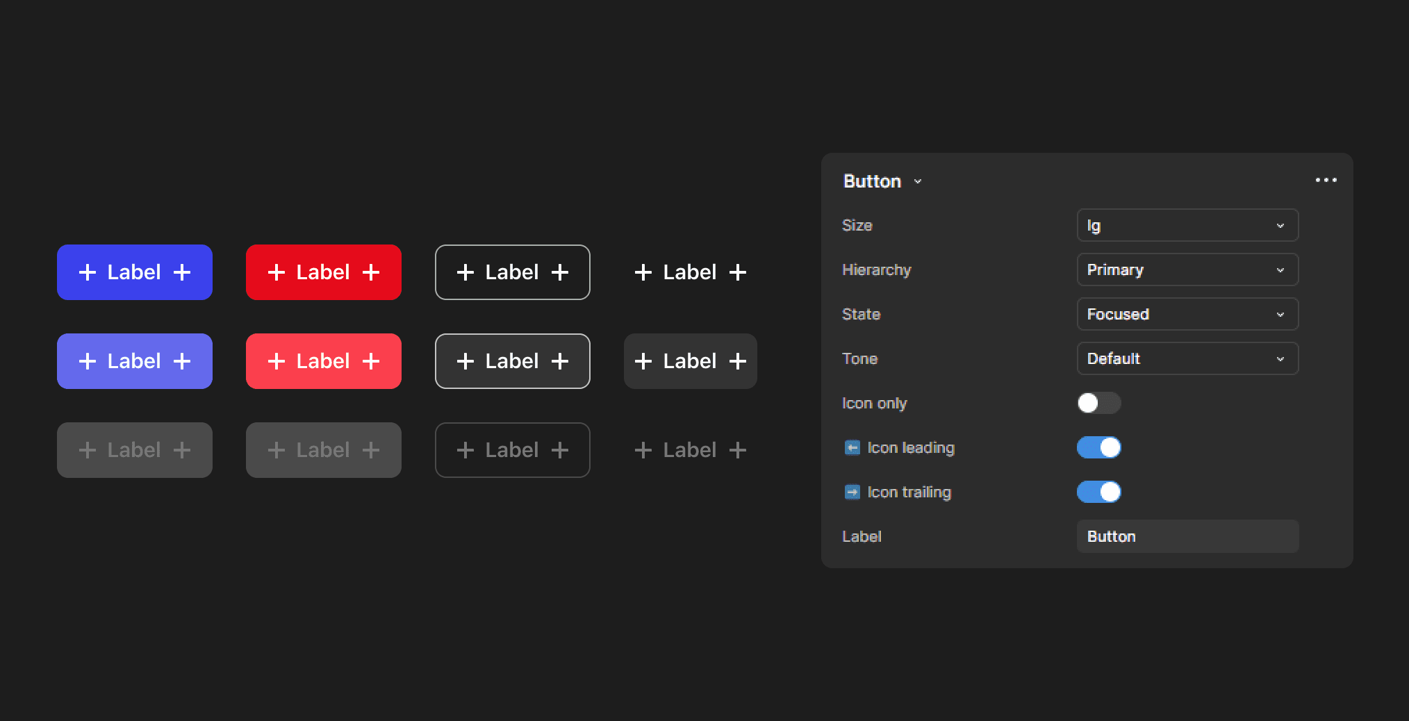
Buttons
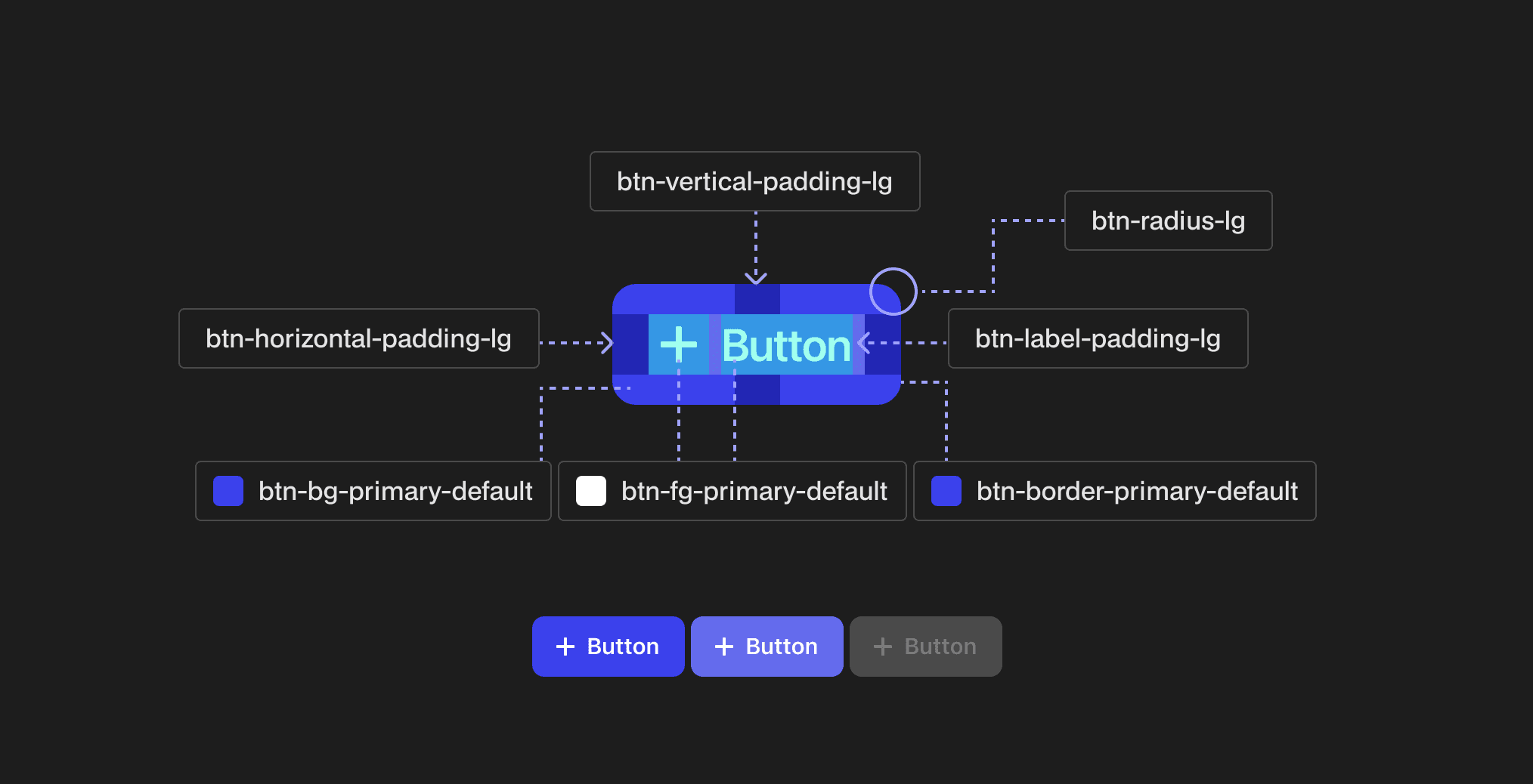
As one of the most frequently used and critical components in any UI, the Button became a prime candidate to showcase the power of our new design system. Its pervasive presence across diverse interfaces – from dialogs and forms to cards and toolbars – meant that its customization was paramount for upholding client brand identity.
Given that buttons directly embody a brand's visual language, encompassing elements like primary action colors, border radius, padding, and typography, they demanded granular control. To empower clients with unprecedented flexibility to align with their unique brand guidelines, we meticulously tokenized every single element and state of the button. This approach allows clients to tailor every visual aspect, ensuring seamless brand integration without compromising system consistency.
Impact & Future Vision
While we're still in the process of fully migrating to our new design token system, the MVP has already delivered significant immediate impact. On the UI design front, the established token logic has led to a noticeably quicker and more efficient design process. Our team can now focus on higher-level problem-solving rather than getting bogged down in granular detail, leveraging the systematic consistency built into the tokens.
Looking ahead, we're actively experimenting with integrating AI into our design workflow. Our aim is to leverage AI for tasks like generating living documentation, automating repetitive design-to-development handoffs, and streamlining the delivery of design specs to engineering platforms like Storybook.